Solutions Website
Responsive Website Redesign
Role
Web Designer
Platform
Responsive Website
Tools
Figma

Problem Statement
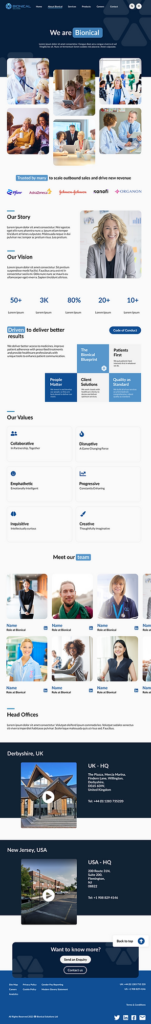
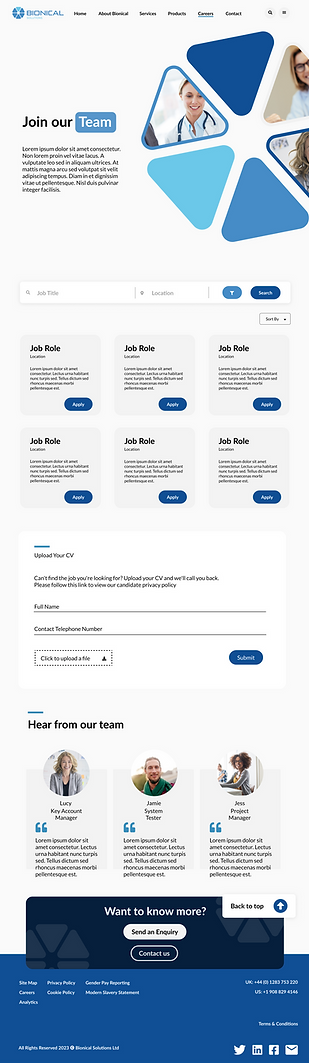
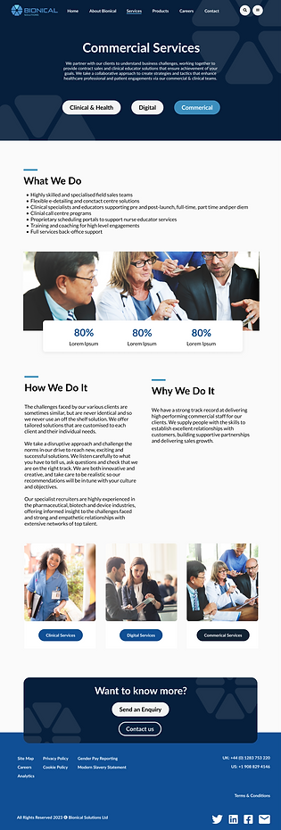
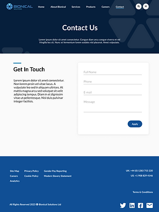
The current site hosts a poor and dated design. Image quality is low, and the design is not fully optimised for different devices / zoom levels. This in turn creates a difficult user experience and poor engagement as a direct result.
Objective
-
Site restructure
-
Site redesign
Goals
Design a user friendly interface that creates focus, simplifies and organises the content of the site which in result will help with customer engagement
Process: Project Workflow
Ensuring a thorough, optimised workflow is fundamental to creating digital experiences. Implementing cohesive process system can aid with structure and clarity of a project, below shares my project system recipe to exceptional results.

01 Discover
Develop an understanding of the user, identifying problems and pain points. Context and brand should be acknowledged, to ensure brand mission / goals can be achieved.

02 Research
Compiling research to support our understanding and assumptions gathered from discovery. Gathering data by interviewing, focus groups, surveys and usability testing.
03 Ideation
Sketching out wireframes, and drafting out low-fidelity designs. Developing user journeys and flows to support development of design, based on gathered data from steps 1 & 2.

04 Design
Converting low-fidelity designs through to high-fidelity, implementing a brand identity while conducting usability testing throughout.

05 Launch
Evaluate design with stakeholders to obtain feedback and develop the product in the design team. Continuous flow of feedback is needed to launch the product.

06 Evaluate
Investigate the effectiveness of the outcome, if the solution targets the problem and user satisfaction is met.
Who is our target user?
Defining our product user is integral to developing context and understanding.
Target audience is typically working population of 18-60.

25, Key Account Manager
Quantitative & Qualitative Research
Conducted an online survey with about 10 users who fall within the target demographic, below are outcomes
40%
40% of users struggle with locating services and products.
30%
30% did not resonate with the 'look and feel' of the site, some even admitting that copy is hard to read, and that the site felt outdated.
20%
20% of users do not understand the brand, and what services are offered.
60%
60% of users did not feel like the site was well organised.
Some below example questions asked, all answered with a 'likert scale' to determine users attitudes
User Needs Based of Key Insights
Users require clear information of the brand and what services are offered
Users require an easy-to-navigate system
Users require a good interface, one that provides a good first impression
The breakdown:
Legible
Functional
Refined
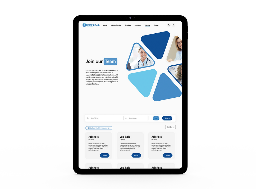
Features & Functionalities
To resolve user needs
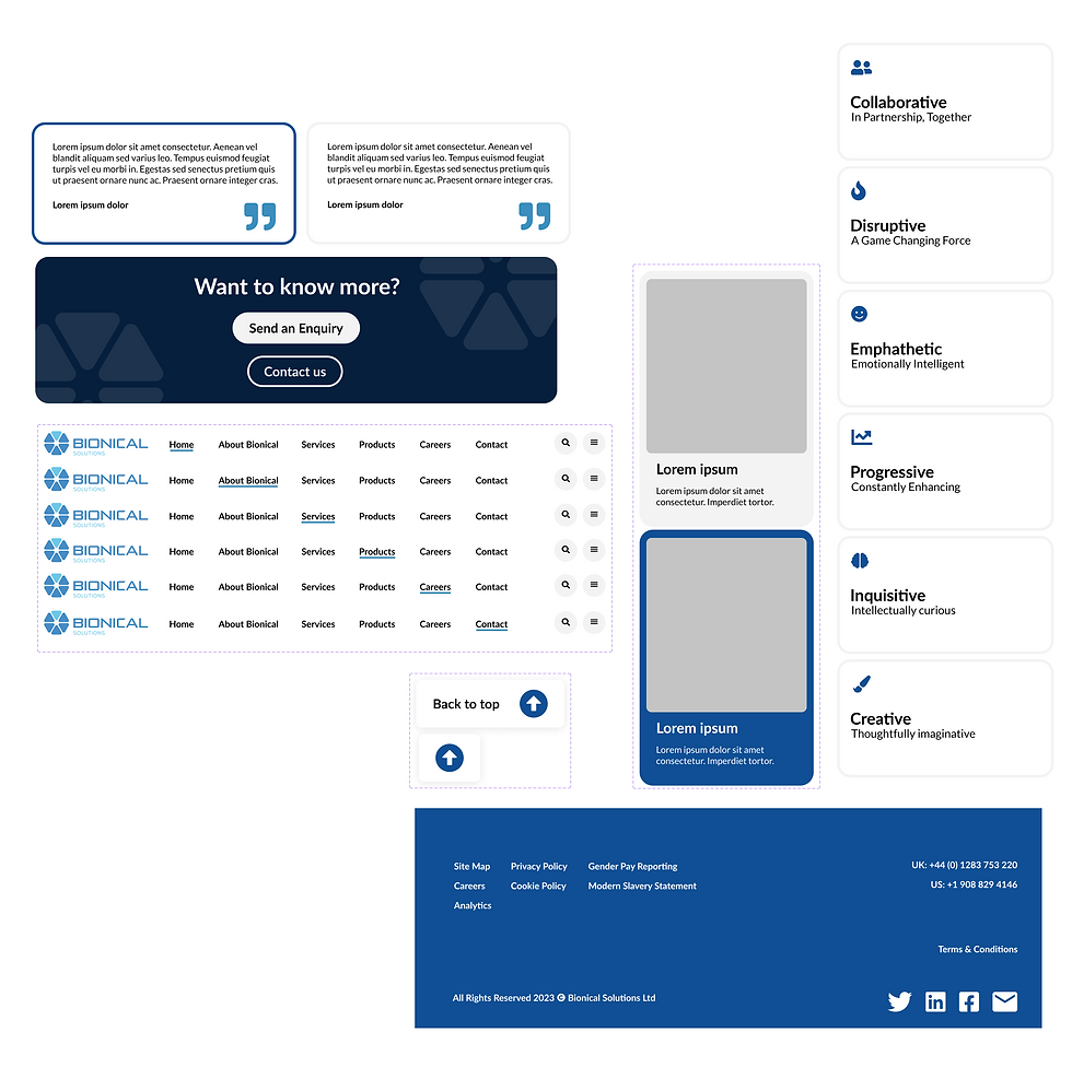
Clear navigation bar, CTA's and breadcrumb trails
Social media links, FAQs
WCAG Compliance, keyboard navigation (accessibility)
Primary / secondary CTAs in homepage
Products and services in homepage
Marking clickable elements
Applying UX Principle
Fitts’s law gives us the relationship between the time it takes a pointer (such as a mouse cursor, a human finger, or a hand) to move to a particular target (e.g., physical or digital button, a physical object) in order to interact with it in some way (e.g., by clicking or tapping it, grasping it, etc.)
Application
Make targets big. CTA's, and key pages will be made bigger to ensure its place on the hierarchy. Targets like this will be clear with a good amount of padding and not distracted amongst other targets. Key targets placed on homepage with thought to minimize users movement time, resulting in speedier interactions.
User Flow

Task Flow
Scenario:
I want to view a product Bionical offers

Scenario:
I want to apply for a job at Bionical

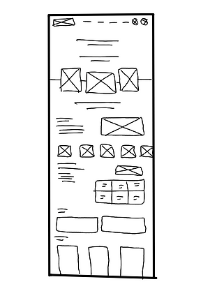
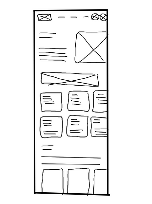
Sketches / Low fi


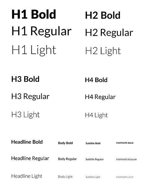
Design System

Hi-Fidelity