The
Besharam Podcast
Product Design
Role
UX UI Design
Web Design
Logo Design
Branding
Platform
Desktop
Mobile
Tools
Figma
About
The Besharam Pod is a podcast which discusses taboo subjects within the South Asian commmunity and is a platform with latest news and entertainment within the community
Goals
Strategise, conceptualise and design an accessible web platform with impact to deliver the the UX and visual design for The Besharam Pod. Creating one destination where users can access information, podcasts, news and entertainment, gaining a strong understanding of topics surrounding the South Asian Community.
Envisoning the experience: Interview
To explore the brand and aims for this project, I had to conduct some research by reaching out to the podcast founder and ask some open-ended questions via interview.
Key Findings and Insights
Create a vibrant, enticing brand appealing to the South Asian youth
Users require an easy-to-navigate system, and can access featured and latest podcasts
Scaleable system, an accessible and easy to understand site
Revitalizing the brand
Before beginning this project, the podcast had little to no brand assets. The first step within the design stage was to break into the core themes of the podcast, and define a brand personality that would stand out within the Podcast environment. Inspiration was taken from old school Bollywood, retro themes and also feminine culture, evolving these personalities into its own engaging visual style.
Logo

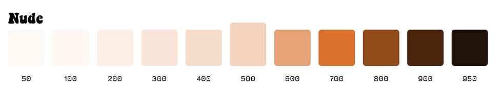
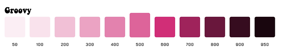
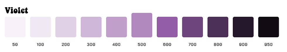
Colours
Ideation
Insights
Solution
Notes
Discoverability
Clear use of CTAs and icons
Clarity
Simple menu and submenu
Clarity
Discoverable actions on landing page
Reduces drop off rates, direct to the user
Acessibility
Features can be componentised, offering links and descriptions
Easy to understand for visitors
Scaleable component system
Web and mobile compatibility
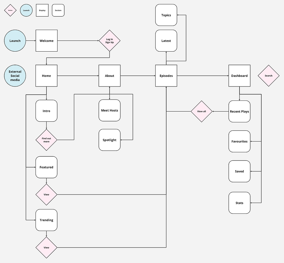
User Flow
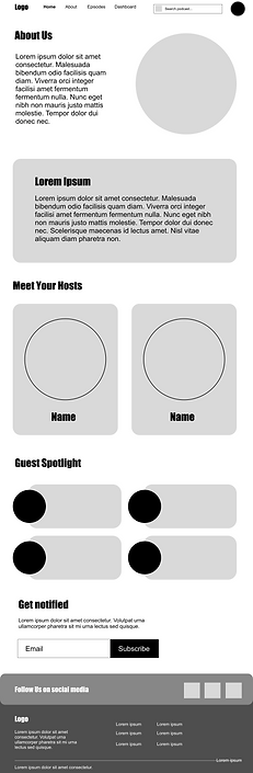
Wireframing


High Fidelity


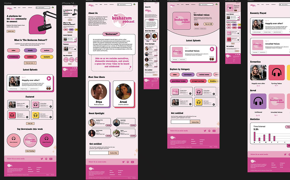
Easy access to information
Prominent navigation menu is positioned at the top of the page, allowing users to navigate sections such as about the podcast, episodes, and a personal dashboard.
Feature cards displaying latest episodes to entice visitors to dive straight into content.
Themes are also easily accessible via prominent CTA's, both describing the podcast and directing users to relevant audios.


Personal Dashboard
A personal dashboard on the podcast offers a comprehensive and personalised experience to listeners. Users can easily access favourite episodes and discover new content aligned with their interests. The page offers valuable insights, convenience and a sense of ownership over their podcast journey.
Refining the system


Responsive Components
Aspects of the design was created responsively and componentised to ensure a scalable system that can be delivered for development across different screen sizes.